Our current set of Asirikuy programs allows us to perform an extensive statistical analysis over the systems and portfolios we run in Asirikuy. Up until recently the Monte Carlo analysis of large portfolio arrays hadn’t been possible due to some memory management problems but now that these problems have been solved it becomes possible to perform a Monte Carlo analysis of this type of large trading setups. On today’s post I want to discuss the interesting finding I have made regarding the distribution of returns in portfolios which – although expected to some extent – reveal surprising aspect of trading system mergers and how they differ from the appearance of distributions of returns of single systems. Through the following post you will see how the distribution of returns usually arranges and what consequences this has for the system performance as a whole.
When you analyze a trading system one of the most important pieces of information you want to have pertains to the distribution of returns – not to confuse with the distribution of monthly returns which is also very important – which allows you to see the probability of achieving a given level of return belonging to a specific return class (which varies according to your choice of grouping classes for the distribution). A distribution of return analysis allows you to see what the most probable outcome for a trade may be and how this outcome changes towards more profitable and less profitable zones. An analysis like this allows you to easily determine the type of system you’re going to be trading, if – for example – you should expect large amounts of small losses and a small amount of huge profitable trades or an homogeneous distribution between the magnitudes of both types of trades.
–
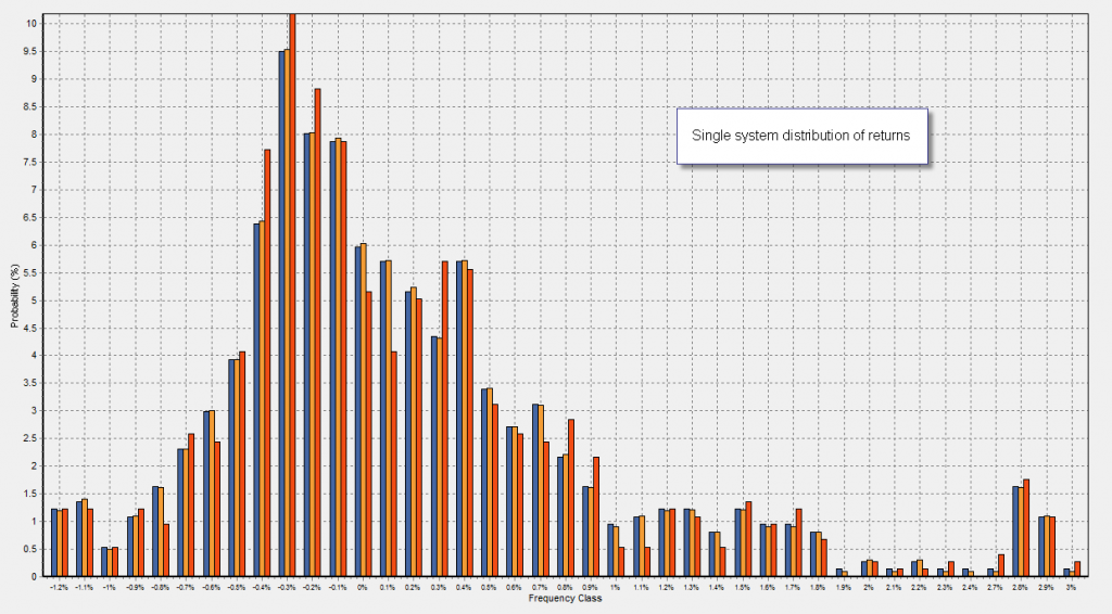
When analyzing single systems – when there is an exit option besides a given SL or TP – the distribution of returns tends to assume a shape which is reminiscent of a regular normal distribution, although from a formal statistical point of view the distributions can rarely be categorized as “formally normal”. Usually for long term trend following systems the distribution of returns tends to have fat tails which are asymmetrical towards profitable territory (showing at least a few occurrences of very high profits) while for systems which are bound to have more symmetrical risk to reward ratios the distribution of returns usually appears evenly distributed with its center being slightly tilted towards positive territory (a positive skewness is necessary for profitability).
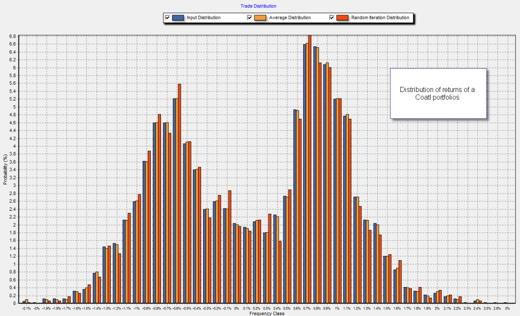
However when you move to analyse the distribution of returns obtained through portfolios the panorama changes a lot since you now have groups of profits and losses which tend to accumulate under two – or even three – distinctive zones. Contrary to the “normal looking” distributions obtained for many single systems, the portfolio distributions usually look like “superimposed” distributions which show you several zones that pertain to the highest probability profits and losses of the given portfolio. The example shown below – belonging to a Coatl portfolio – clearly shows how this happens. You get a part which is clearly centered on losing territory while the other part (which has a higher area) is usually centered on profitable territory. When you put together systems that have long term trend following characteristics with ones that don’t it is even common to see a third group which is centered on even yet more profitable territory, although with a smaller area than the former two.
This “odd way” in which portfolio returns are distributed talks about the overall ability of the systems to interact with each other to generate a “new and better” trading entity. The curve of a portfolio is no simple overlap of separate systems but a whole new structure that allows us to see how systems interact. We can compare the maximum profit and loss probability classes with those of the single systems to see how the values shift when compared to individual components and we can also measure the are of the distribution under losing and winning territory to determine how the portfolio favors the probability to get a winning trade overall against a losing trade. By doing these comparisons we can see how the portfolio is different from individual components, knowing how the grouping of systems have changed their net trading outcome.
–
Certainly there are many possible analysis and it becomes very interesting to see how the distribution of returns changes for different portfolios and mix compositions. As a matter of fact we could even build an understanding of how the addition of different systems affects the portfolio distribution of returns, allowing us to learn how to “tweak the results” with the addition of strategies of a determined kind. By looking at how losses and profits are grouped and what their probabilities are we could get an idea of which system(s) might be more complimentary to a given trading setup.
If you would like to learn more about my work in automated trading and how you too can perform distribution based analysis of your systems please consider joining Asirikuy.com, a website filled with educational videos, trading systems, development and a sound, honest and transparent approach towards automated trading in general . I hope you enjoyed this article ! :o)


