Last week we used the R statistical package in order to analyse an array of IS/OS system characteristics and derive from them some simple conclusions regarding IS/OS historical correlations. Today we are going to use R to do a more fundamental analysis that should be done before system generation. This analysis corresponds to basic characterization of financial time series, which gives us some fundamental information about the symbols we are going to trade. By doing this analysis we will be able to find out where it might be easier to develop traditional alpha seeking algorithmic strategies and whether some things (such a fundamental long term bias) exist within a given symbol. Within this first tutorial we will cover some basic statistical characteristics of financial time series, if there are any useful characteristics you think are missing please post a comment with your observation (I will certainly include them within the next few parts).
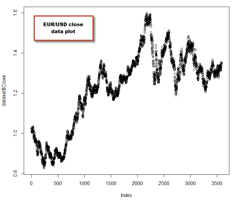
First of all we should ensure that our data is contained within a csv file that is friendly for R. We want to have Open/High/Low/Close columns as well as a Date column that should contain candle opening times in a format adequate for R (for example 1986-03-23). Remember that R needs to have adequate column headers so the first line of our csv should read something like “Date,Open,High,Low,Close”. It is important for data to be formatted in this way as we will be using other libraries that require this express formatting (such as quantmod) within the next few posts on this series (when we will be performing more advanced analysis, such as Hurst exponent estimations). Make sure you have also installed the e1071 R library before continuing further, as we will need it for some basic statistical calculations. Once you have your data ready you can now load it into R and plot it to confirm it’s loaded properly (note that we will learn how to plot prettier candlestick charts when we use quantmod:
–
dataset <- read.csv("C:/PathToCSV/EURUSD_1440.csv")
plot(dataset$Close)
–
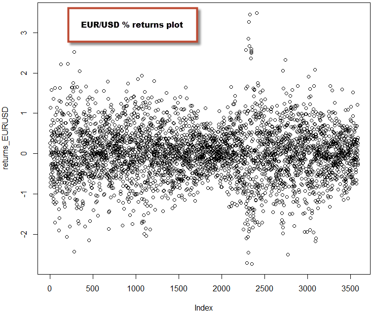
Once we have our data loaded we can now calculate the return of the price series in order to have some statistical quantity that we can compare across the different symbols as the Open/High/Low/Close data are not directly comparable. The percentage return is simply given by 100*(Close[n]-Close[n-1]/Close[n-1]), note that we are not using the Close[n]-Open[n] difference because gaps play a very important role across certain instruments, so we need to take them into account within the calculation. It is also worth noting that the returns based on log(Close[n]) are also commonly used, as these values give results that are closer to a normal distribution across most financial time series. Which one to use depends primarily on whether your analysis requires an assumption of normality, for this tutorial we’re going to use the standard percentage returns. Checkout this link for more information regarding the different types of return that can be used. In order to calculate the returns we need to issue some additional R commands:
–
returns_EURUSD <- diff(dataset$Close)
for (i in 1:length(dataset$Close) ) {
returns_EURUSD[i-1] = 100*(dataset$Close[i]-dataset$Close[i-1])/dataset$Close[i-1]
}
plot(returns_EURUSD)
–
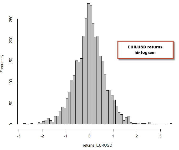
I calculated the returns by first populating an array with a differential and then repopulating it with the correct normalized difference based on the previous close values. There is probably a better way to do this in R (please post a comment if you know!) but I simply did it using what my C++ mentality told me to ;o). We can now proceed to perform some additional calculations that will reveal some interesting statistics about the time series. We can calculate the mean, skewness, kurtosis and serial autocorrelations for our returns. The skewness tells us how skewed the distribution is towards negative or positive values (a perfectly symmetrical probability distribution would give a 0) while the kurtosis tells us how fat-tailed (high kurtosis) or highly peaked (low kurtosis) our distribution is compared to a normal distribution. A high kurtosis implies that the variance within your distribution is more likely the result of extreme infrequent variations. We can also obtain a histogram to have a better look at these variations.
–
mean(returns_EURUSD)
skewness(returns_EURUSD)
sd(returns_EURUSD)
kurtosis(returns_EURUSD)
hist(returns_EURUSD,breaks=60,col='grey')
–
As you can see from the above, the returns for the EUR/USD deviate significantly from a normal distribution (more on normality tests on a future post) and we can already see some characteristics of the EUR/USD distribution. For example we can see that the distribution is skewed towards positive territory (skewness=0.076) and the distribution is fat-tailed (kurtosis=1.52). None of these two facts should be surprising for anyone who has done time series analysis, as financial time series are well known to be fat-tailed. However it is worth noting that the degree of kurtosis and skewness change a lot depending on the asset class and symbol you’re studying. On the next part of these series we’re going to go into how different Forex and non-Forex symbols compare within this same analysis (plus some additional statistics) and how these statistics are related with our ability to generate historically profitable trading systems using that data. You will see that distributions that have certain characteristics easily lead to a large potential number of historically profitable strategies, while distributions that have other characteristics are very hard to find edges on.
For those of you who are well versed in statistics, feel free to contribute what basic statistical analysis aspects you find useful and which ones you would like me to explain within a future post. If you would like to learn more about my work and how you too can use time series analysis to develop trading strategies please consider joining Asirikuy.com, a website filled with educational videos, trading systems, development and a sound, honest and transparent approach towards automated trading in general . I hope you enjoyed this article ! :o)


[…] part one of this series of posts we obtained some simple fundamental characteristics from a Forex financial time series in […]
[…] to be the easiest. Before following this tutorial I would also advice you to read my previous two (1 , 2)R tutorials on basic time series analysis, so that you are familiarized with some basic R […]
Hi Daniel,
sorry but im facing this problem:
Error in plot.window(…) : need finite ‘xlim’ values
In addition: Warning messages:
1: In min(x) : no non-missing arguments to min; returning Inf
2: In max(x) : no non-missing arguments to max; returning -Inf
3: In min(x) : no non-missing arguments to min; returning Inf
4: In max(x) : no non-missing arguments to max; returning -Inf
> dataset plot(dataset$Close)