The free and open source OpenKantu trading system generator allows you to create price action based strategies for the Forex market within some desired historical performance thresholds. However the program’s output can be quite complex and the analysis of all the resulting data can be daunting, especially for novice traders. On today’s post I want to share with you how you can analyze this data in detail using R. We will learn how to save the performance data to a CSV, how to load the data into a proper R dataframe and how to process this dataframe in order to obtain important information about how the different values are related. After going through this post you will be able to create your own R scripts for the processing and analysis of your OpenKantu data-mining results.
–
library(corrgram)
library(ggplot2)

data <- read.csv("/pathToCSVFile/optimization_data.csv")

data$P <- NULL
data$No. <- NULL
data$Symbol <- NULL
–
The first thing we must do is save the data in an appropriate format for loading into R. The program allows you to easily do this by right clicking on the results grid (where all the statistics show up) and clicking the “Save as CSV” options. Once your data is loaded into a CSV you will notice that the CSV contains columns for all the in-mining-sample (IMS) variables and the out-of-mining-sample (OMS) variables. Usually you won’t want to explore the relationship of your IMS with all the OMS variables so you can open up the file in a spreadsheet processing program (like LibreOffica calc or Excel) and remove all OS variables except one. This will make processing far easier down the line. For the example I will show you today – 600 EURUSD daily systems generated from 1987-2010 with only a 10 trade/year filter and an OMS from 2010-2015 – we will only be leaving the OSP (out of mining sample profit) for analysis within R.
I would also like to make a small note about why I am calling the second period out-of-mining-sample instead of simply out-of-sample. This period constitutes a set of data that is not used within the individual mining exercise we are testing but it is not a true out of sample period because it can be reused under subsequent exercises and therefore it is in reality an in-sample period. Imagine that you discover some correlation between the ISM and the OSM and then you change how you mine to get better results in the OMS, you are using its data to affect its results and therefore the results are not a real out of sample. In reality no historical period is a true out of sample (please read this article to learn more about this), only live trading under unknown conditions represents a real out of sample period. In summary if you can go back, make changes and try again, it’s not a real out of sample.
–
corrgram(data)
cor(data)
–
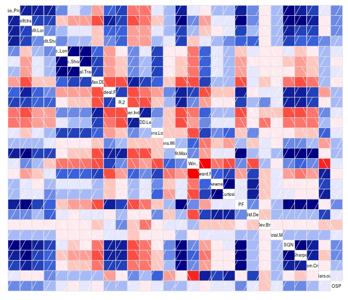
Once we have our data in the proper format – a csv with all ISM variables plus a single OSM variable – we can then proceed to load our data into R. Note that I will be making use of the ggplot2 and corrgram libraries so you should also install and load these libraries as showed on the first R code above. As you can see I am also removing the P, No and Symbol columns as they won’t be useful for the analysis procedures we will be performing. The first thing we’ll want to do is create a global overview of how our ISM values are related between each other and with the OSM variable we have chosen. For this we use the corrgram library to create a general correlation diagram that shows us the strength of correlations between the variables. Blue values indicate strong positive correlations (the darker the stronger) and redder values imply strong negative correlations. The cor(data) command shows us the numerical values for all these boxes so that we can gauge the actual strength of the correlations by numbers.
–
ggplot(data, aes(x=SQN, y=OSP)) +
geom_point(shape=1)

qplot(data$SQN,
      geom="histogram",
      binwidth = 0.3,
      main = "SQN histogram",
      xlab = "SQN",
      ylab = "frequency",
      fill=I("green"),
      col=I("red"),
      alpha=I(.2))
–
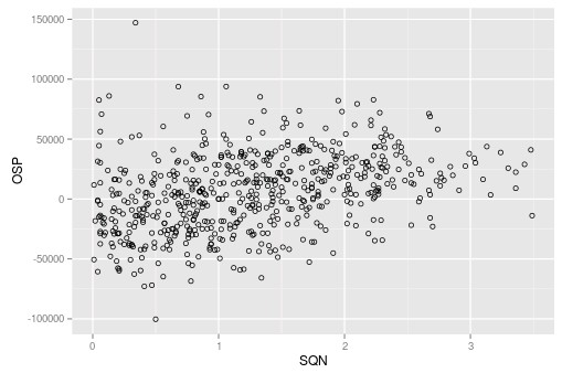
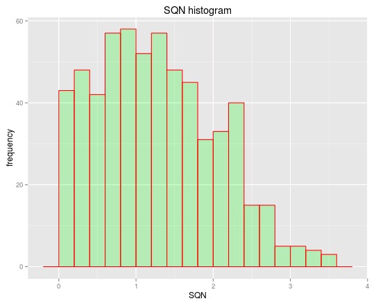
In the case above the strongest correlation between the OSP and an ISM variable belongs to the SQN (R=0.35) so we can go deeper into this by plotting both the SQN and the OSP on a graph to see how this relationship is actually expressed. You can also change the code to plot any pair of variables to want to see how they might relate with each other. For example we may also want to plot the R² or Absolute Profit vs the SQN to see how these other ISM variables relate with this parameter. The code above also shows you how to plot a histogram of the SQN variables so that you can also see how the SQN is distributed among the systems found within the mining exercise. You can adjust the binwidth when plotting the histogram of other variables so that you can get a better looking distribution.
The above shows you how you can load data from OpenKantu into R to get a much deeper view into the relationships between different variables. You can evaluate correlations between ISM and OSM statistics and you can also look into how ISM and OSM variables are distributed through the test. Using the above procedures you can create your own R scripts that will show you the exact information you want from your OpenKantu mining runs. If you would like to learn more about statistical analysis and how we mine and validate systems please consider joining Asirikuy.com, a website filled with educational videos, trading systems, development and a sound, honest and transparent approach towards automated trading.


