With today’s article I want to start a new series of blog posts where we will be using the R statistical software in order to analyse several aspects pertaining to algorithmic trading, especially system generation. These blog posts will show you how to go deeper into the analysis of results obtained from an automated system generation process using powerful and easy-to-use statistical analysis tools. Most of these posts will use data derived from the Kantu Parameterless System generator, which you can also obtain by using the program’s demo (available here), I also recommend R studio, which you can get here. On today’s blog post we are going to find out how we can explore the correlations between in-sample (IS) and out-of-sample (OS) variables, in a group of strategies created using Kantu. For this analysis I have used EUR/USD 1D data from 1986 to 2012 (included within the Kantu demo download, this data is also available for free at forex-historical.com). If you want to reproduce my analysis without generating the systems yourself you can get the data used within this post here.
–
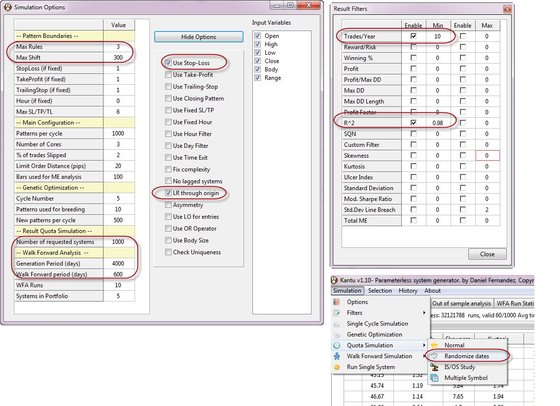
A key aspect of algorithmic trading is to be able to pick a system to trade from a pool of available strategies. You would certainly want to trade a strategy with a high chance of success under unknown market conditions and – since the future is unknown – the best we can do is to draw some correlations from past data and determine the past correlations between IS and OS variables. In order to do this we must create a series of strategies that match what we consider acceptable criteria for historical performance in the IS and we then examine the data to see what relationships have been valid historically. In order to do this we will generate systems with an acceptable trading frequency and linearity on the EUR/USD 1D data. We setup Kantu filters and options as showed above. Note that the “LR Through Origin” (Linear Regression Through Origin) option is set to true and the R^2 filter is set to a minimum of 0.98. The Trades/Year is also set to a minimum of 10 in order to have statistically significant results. The above setup generates systems through 4000 days of data and then out-of-sample tests them on the next 600, a maximum of 1000 systems will be generated.
After loading the data for the EUR/USD you can then run the simulation by going to “Quota Simulation”->”Randomize Dates”. The randomize dates simulation type selects random 4000 IS/ 600 OS periods through the whole 1986-2012 data set, in order to find strategies that comply with our required filters across several different regions of the requested data. This random selection of roughly 11 years through the 26 year period allows us to obtain conclusions that are more general and not merely belonging to a single trading period selected. This is important because there might be a period where high Reward to Risk strategies were favored but we don’t want to find this correlation unless it’s been a historical constant on the EUR/USD through the majority of IS/OS pairs.
The system generation process will take a while since the filter is highly demanding, the generation of 1000 strategies can take a bit more than one week using the 8 available threads on an intel i7 4770k, amounting to a bit more than 30 million tested systems. This shows that finding highly linear systems is no walk in the park. Once we find the systems required we can then perform an analysis of our results by first saving the csv file (right click on the results grid and select the save to csv file option). After this we can then run some R scripts in order to discover the correlations between our IS variables and the OS Profit and OS Profit/trade variables.
–
dataset <- read.csv("C:/PathToCSV/CSVFileName.csv")
dataset$Custom.Criteria <- NULL
dataset$No. <- NULL
dataset$P <- NULL
dataset$Symbol <- NULL
cor(dataset$OSP,dataset)
–
–
The first thing we want to do in R is load our data from the csv file into an appropriate dataset and eliminate variable which are not meaningful for our analysis. For this reason we eliminate the Custom.Criteria (in this case 0), the system number, the portfolio identifier and the symbol. After this we can now carry out a correlation analysis using the cor command, allowing us to see a correlation matrix between the OSP variable (the OS profit) and all the in-sample variables. This already gives us some valuable information, such as high correlations between the OSP and the in-sample profit (0.717) as well as a highly inverse correlation between the OSP and the in-sample profit factor ( http://vintagegoodness.com/new-goodness-at-auction-on-ebay-this-week-15/ can you think why the PF is negatively correlated with the OSP? Leave a comment!).
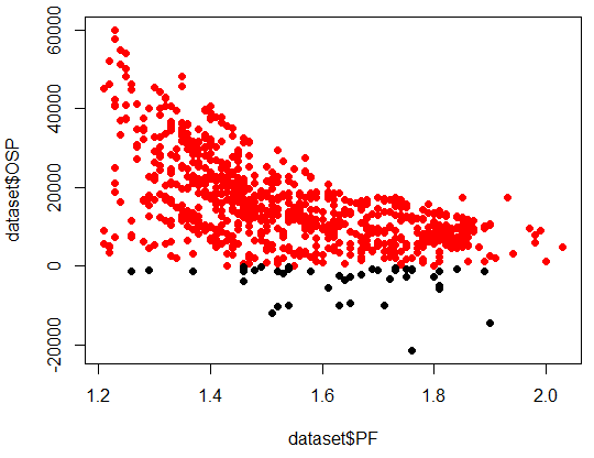
The next thing we want to do is to plot some variables against one another in order to look at the overall relationship between our IS and OS variables. Note that the high correlations between some IS/OS variables might make you think that you would find a straight line when plotting them together, this is often not the case. In order to make things easier to analyse we also color positive OS results red while negative results are colored black. This allows us to easily see which IS variable values have led to bad OS results. Below we can see the graph obtained for the PF (first line of the code below). The probability of having a positive OSP result decreases exponentially as the in-sample PF grows larger.
-
plot(dataset$PF,dataset$OSP,col=((dataset$OSP >0) +1),pch=19)
plot(dataset$Abs..Profit,dataset$OSP,col=((dataset$OSP >0) +1),pch=19)
–
–
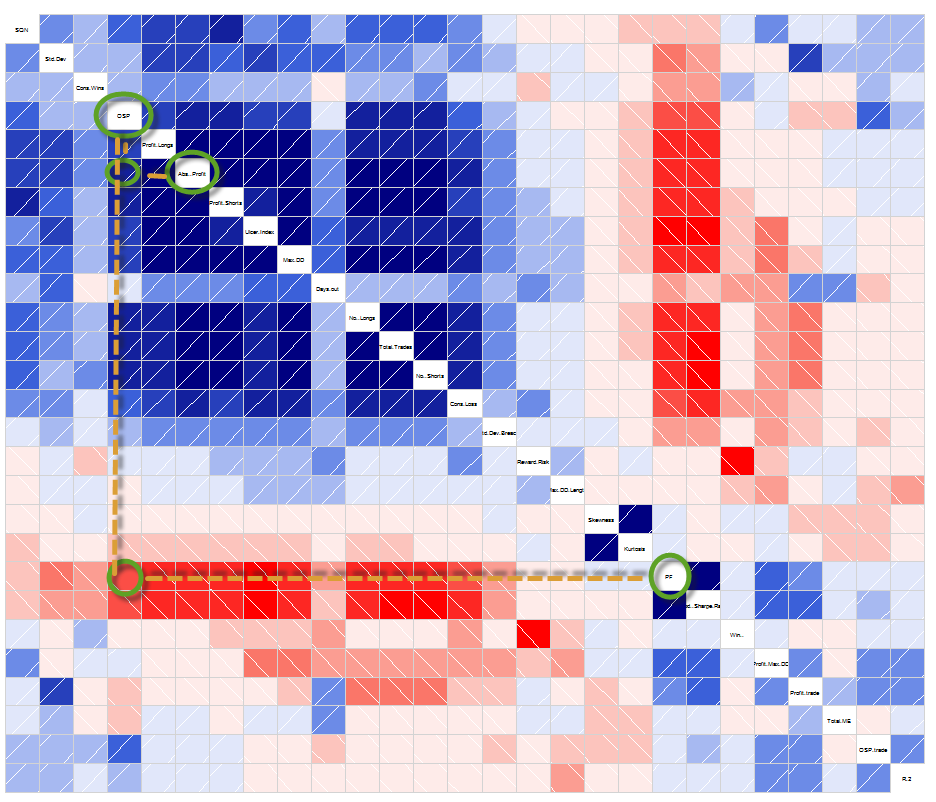
However we might also want to take a look at the overall correlations between all IS variables, among themselves and with OS variables. In order to do this we can use the corrgram library that allows us to create very useful correlation diagrams that display – in an easy to analyse fashion – the correlations between all relevant variables (you need to install the corrgram variable in R in order to use it, very easy to do in R studio). The stronger the blue color the more positive a correlation between two variables is (closer to 1) while the redder the color the more strongly inverse (close to -1) the correlation is.
–
 library(corrgram)
corrgram(dataset, order=TRUE, cex.labels=0.6)
–
–
We can also see some interesting things here, such as a strong inverse correlation between the Winning Percentage and the Reward to Risk ratio (not surprising). However what is interesting is that the multiplication of both of these variables isn’t constant, but increases as the Reward to risk ratio increases, meaning that IS expectancy increases as the Reward to Risk ratio increases. You can analyse the relationship between this (Winning%) X (Reward to Risk) variable with the OS profit as an exercise.
The above results reveal that OS expectancy for highly linear systems (generated through 4000 days) on the EUR/USD daily charts for a 600 day horizon have been positively and strongly correlated with the Absolute Profit and the Total Trades while the results have been inversely correlated with the PF and the Sharpe Ratio. How would you pick a system from a pool of highly linear systems if you wanted to start trading tomorrow? Feel free to leave your criteria within the comments below :o)
If you would like to learn more about Kantu and how you too can generate and trade strategies generated with it please consider joining Asirikuy.com, a website filled with educational videos, trading systems, development and a sound, honest and transparent approach towards automated trading in general . I hope you enjoyed this article ! :o)


Hello Daniel,
thanks for the interesting insight, first of all.
At the moment I have only a comment concerning the correlation coefficients you have calculated: I think it would be useful also to specify their confidence intervals, since I found them relative often well below a 95% threshold (for example).
Regards,
Lorenzo
Hi Lorenzo,
Thanks for your post :o) I don’t know very well what you mean by the confidence intervals for the correlation coefficients. Feel free to clarify so that I can give any additional information you might need,
Best Regards,
Daniel
Hi Daniel,
what I meant is that we should still prove that the correlation is significant. In other words, evaluating the probability (as p-value) that the obtained correlation coefficient has been obtained by random chance, while actually having correlation zero.
Another quick point: you are posting a lot of hot stuff recently and very frequently. Still, the site keeps the structure of a blog: wouldn’t be the case to classify the threads by topic, rather than chronologically?
Thanks! :-)
Lorenzo
Hi Lorenzo,
Thank you for your post :o) Oh ok! Now I understand better, sure, evaluating the significance of the correlations is also important. Note that at an R^2 > 98 and trade numbers > 100 we can reject the null hypothesis at a 95% confidence interval every time. I therefore believe that given the assumption of +10 trades/year and at least 10+ year tests we can have a high confidence in that the correlation does not arise due to random chance. Let me know if you have a different view on this.
About the blog format, the blog is split into topics as well, which you can access through the tags on the bottom right of the screen. You can also use the search bar at the top right to find any articles. Thanks a lot for commenting :o)
Best Regards,
Daniel
Hi Daniel,
Great analysis and work!!, I have to catch up in your last developments at Asirikuy!! guau!!
Regarding why there is an inverse correlation among PF and OSP, I think it’s normal because there is also a negative correlation among Abs.Profit and PF.
I recommend you to use “Pairs” function in R for better multi-variable correlation graphs, example (use it before deleting columns):
> pairs(dataset[,c(4,5,10,11,13,16,17,18,21,22,29,30,31)], lower.panel = panel.smooth, upper.panel = NULL, col = “skyblue3”, cex = 0.2)
The question maybe is why there is a negative corr. among Abs.Profit & PF?, I think is because there is also a negative correlation among PF and Total.Trades, so less PF –> more trades, and more trades –> more Abs.Profit and more OSP
Regards,
JL
Hi JL,
Thanks for your post :o) It’s interesting because this implies that more trades decrease the expectation of absolute profit Vs absolute loss, meaning that the more you trade the less money you’re expected to make compared to the money you’re prepared to lose, however the more you trade the more money you also expect to make in absolute terms. Clearly the picture here isn’t complete – we’re missing other important OS variables, such as the OS PF – but this already hints at some aspects of IS/OS correlations (at least for EUR/USD daily systems).
Thanks for the multi-variable correlation graphs function tip. I like the corrgram function better because I think the graphs are easier to interpret, especially when you have many data points. However I see what you mean. Thanks a lot for posting :o)
Best Regards,
Daniel
Well, the negative correlation is due to curve-fitting.
BUT, your analysis hides some serious logical errors. Because I wore a rain coat today it does not mean it’s going to rain.
The thing is that after all this good work you pose the question to the readers, meaning that you don’t know the answer:
“How would you pick a system from a pool of highly linear systems if you wanted to start trading tomorrow? Feel free to leave your criteria within the comments below :o)”
The answer is that there is not one answer but many depending on situation and this is the reason trading is too difficult. But doing all this work and then ending with a question it peculiar, to say the least.
Hi Bob,
Thanks for posting :o) I doubt the correlation is due to curve-fitting (the PF Vs Absolute profit), the correlation happens across different instruments and across many different time period selections, I would say it’s something more fundamental than it may seem within this sample.
Sure, causality and correlation are two different things, I get your point. There is no guarantee that a historical correlation between IS/OS variables will exist in the future. However we can know nothing about the future and this – testing a past hypothesis to see if it worked before – is as far as we can go. There is no crystal ball so any selection or system production method, however rigorous, will always be subject to some chance of being spurious.
About the question, it’s just to invite the audience to comment with their ideas and generate discussion ;o) Clearly I know the answer is not simple, that’s why I wanted to generate some debate. Thanks a lot for posting!
Best Regards,
Daniel
“…meaning that IS expectancy increases as the Reward to Risk ratio increases.”
I think you do not have to go through all this pain to rediscover the obvious fact the expectancy is a linear function of R:R and win rate.
“The above results reveal that OS expectancy for highly linear systems (generated through 4000 days) on the EUR/USD daily charts for a 600 day horizon have been positively and strongly correlated with the Absolute Profit and the Total Trades.”
DO you mean the OS expectancy is strongly correlated to IS abs profit and total trades or to OS abs profit and total trades?
There might be other ways to find out, it’s just one of the conclusions from this small study as well.
I mean that the OS expectancy is strongly correlated to the IS absolute profit and IS total trades.
Thanks again for commenting Bob :o)
Daniel