When most of us look at the long term results of our trading systems we tend to look at a raw equity curve which shows the growth of capital over a linear scale. While this provides a generally good view of how a system has performed it does skew results tremendously as distortions appear larger as equity grows larger. In order to eliminate most of the problems of the linear equity curve it becomes a necessity to use a way of displaying gains which does not play “visual tricks” on us. As trading systems should ideally grow capital at an exponential rate it therefore becomes necessary to look at their results through a logarithmic scale in order to see how good the results really are and evaluate the strategy’s real potential. On today’s post I will talk about the use of logarithmic curves to analyze systems and why they are so much better than pure linear ones.
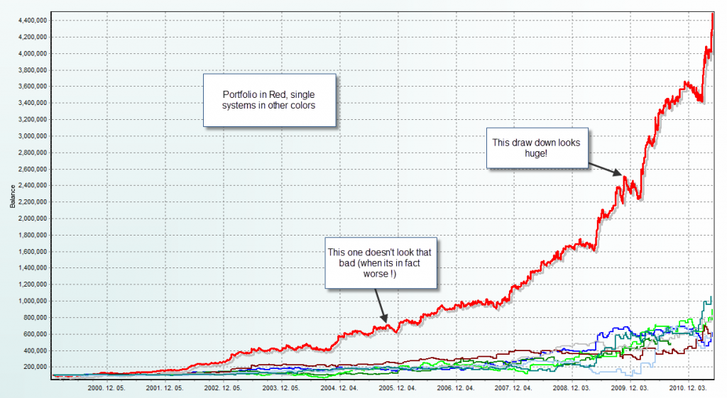
You have just finished doing your portfolio analysis and you have come up with an equity curve which is simply amazing. However you feel a little bit uneasy at a “huge dip” within the last two years of trading that appears very large in proportion to any other draw down seen within the chart. As you analyze your data deeper the issue is nonetheless different as it turns out that the draw down you thought was “the worst” was actually just a 10% loss while the actual deepest percentage based dip in equity had been many years earlier on what seemed to be an almost indistinguishable small “hole” on your graph. What happened here? Where the numbers wrong?
–
–
No! The problem here is that when we evaluate trading systems through long term periods of time as the amount of capital grows less significant draw downs becomes bigger. For example if you start a simulation with 100K USD and there is a 10% draw down it will be 10K while if this draw down happens near the end of the simulations (where lets suppose you’ve made it to 3 million) a 1% draw down will be a dip in capital of 30K. You can see here how visually a linear based balance curve is misleading as you can lose perception of large relative draw downs as the draw downs on later periods are bigger in terms of absolute lost capital. Perhaps the largest draw down on the above example was a 10K drop in the beginning of the test while that huge 100K deep was just a 3% draw down near the end of the test.
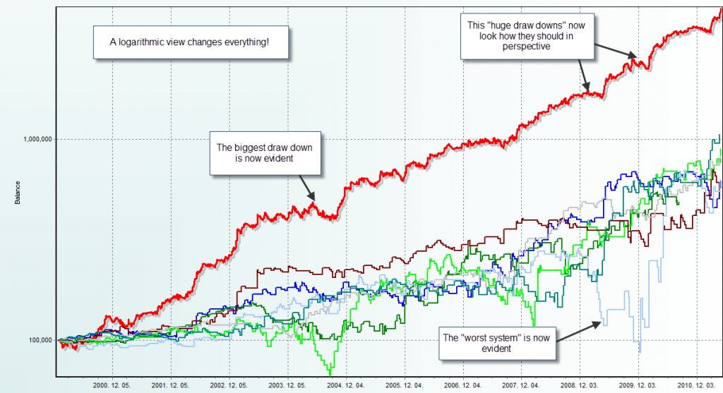
How do we solve this problem? The answer is to scale the charts so that this deception is eliminated. This is achieved through the use of a logarithmic scale. In a logarithmic scale you plot equally spaced orders of magnitude on the vertical axis of your charts in such a way that the distance between 10-100 is the same as the distance between 100-1,000 and the distance between 1,000-10,000. The magic of the logarithmic chart is that it makes both draw down and growth equally proportionate in all periods so a system which is very good (has very exponential growth) will always tend to have a very linear balance growth graph when plotted in a logarithmic scale. A “perfect portfolio” would give a perfect line with no dips.
Another great thing about this is that it makes analysis across all periods equal so draw downs in the beginning will look just as huge or small as a draw down when the account has grown considerably. In the above example the 10K draw down would now look quite big and the later draw downs would look as much smaller dips as they represent smaller percentage based drops in balance. The logarithmic plot of the balance graph allows you to easily see systems without being fooled or blinded by the effect of compounding. With a logarithmic plot you’ll easily be able to see which system was the mos profitable, which one was the worst and which one had the deepest draw downs. You’ll also be able to compare draw downs on an apples-to-apples basis throughout the whole length of your simulation or trading record.
–
–
In the graphs shown above you can see how this effect is so dramatic between both curves. When we see the linear one we get almost no useful information as draw downs in earlier periods are very small and we are fooled into thinking that the later draw downs are the “worst” since they appear the biggest from a visual perspective. However once we change to a logarithmic view things look a lot clearer and we’re able to perfectly see the where our portfolio did worst and we are also also able to see which system took the biggest dip from an adequately adjusted perspective. You can also play a lot more with logarithmic charts, for example you can implement standard deviation measurements which can serve as tools to determine worst case scenarios in conjunction with Monte Carlo simulations.
For Asirikuy members you can get a logarithmic view of any of your charts on our profit and draw down analysis tool (on the equity/balance graph view simply change the graph type on the top left corner). If you would like to learn more about my work in automated trading and how you too can get a true education in this regard please consider joining Asirikuy.com, a website filled with educational videos, trading systems, development and a sound, honest and transparent approach towards automated trading in general . I hope you enjoyed this article ! :o)


Daniel,
What a simple and elegant idea! Wow!
Maxim
Hi Maxim,
Thank you for your comment :o) Actually I got the idea from Mihaly who told me he has been using them for a while. Gabor also had this in mind since this feature was implemented a long time ago on the tool. Definitely I also learn a lot from Asirikuy members :o)
Best Regards,
Daniel
I have always used a logarithmic scale for viewing the equity curves when developing my trading systems. Since I always trade a fixed percentage of my equity, I prefer to consider everything in terms of ratios instead of absolute values viewed on a linear scale.
Hi Daniel,
Would a cumulative monthly or weekly % yield chart give, in effect, the same clarity as the logarithmic scale since it is dealing with percentages rather than absolute values?
Best wishes,
Jeff
Hi Jeff,
Thank you for your comment :o) It depends on how you define the percentages. If the percentages are defined as the percentage growth relative to the initial capital at the start of each period then the answer is yes, although this is a far more complicated solution than a logarithmic chart. Thanks again for your post!
Best Regards,
Daniel
ohhhhh? I’m confused.
I would have thought that if it were percentage growth relative to the initial (starting) capital then it would have the same problem as using the linear scale you describe above since returns of later years would be grossly distorted.
I was thinking that it should be percentage growth of current capital at the time of the trade.
Hi Jeff,
Yes, that is what I said : if the percentage growth relative to the initial capital at the START of EACH period is used (so use the balance at the beginning of the week to calculate each week’s return, at the beginning of the month for each monthly return, etc). Clearly if you use the starting balance it will NOT work, you need to use the balance at the beginning of each period you’re calculating the percentage gain for.
Daniel
Sorry, misread it! :-)
The Asirikuy Profit & DD tool has the weekly yields, so presumably it is easy to draw a graph from that data? (That is what I do by exporting it to Excel).
Best wishes,
Jeff