During part one of this series of posts we obtained some simple fundamental characteristics from a Forex financial time series in R. On this second part we are now going to go a bit deeper into our analysis, comparing against a normal distribution and against other financial instruments in order to find out some important characteristics of the financial instrument we are studying. Within today’s post you will learn how to generate a normal distribution in R, how to compare your data against it and how to compare the data from your financial time series against other data. In order to follow today’s post adequately, make sure you can carry out all the analysis steps highlighted on the first post from this series. To start this tutorial make sure you have loaded your csv data and have adequately calculated your percentage returns as we did previously. If you have any suggestions for future “Using R in Algorithmic trading” posts, feel free to leave them on the comments :o)
Now that we have our percentage returns and some simple statistical characteristics we can now ask two simple questions that will allow us to learn more about the financial time series we’re studying. First of all, we should ask how our distribution of returns compare against standard distributions – in particular the normal distribution – as this will allow us to make use of powerful theoretical tools (such as the central limit theorem) within our analysis. You can read more here about why having normally distributed data is so useful in statistics. The second question we can ask is how our distribution of returns compared against the same distribution for other instruments. Does our instrument have more or less long term bias than another instrument? Is our instrument close or further away from a normal distribution? Is our instrument more skewed, more fat-tailed? These are all questions where the answer can help us understand if system generation will be easier or harder and what type of system might lead to better historical results. Let us first learn how we can generate normally distributed data for comparison. In R you can use the rnorm function in order to create normally distributed data :
–
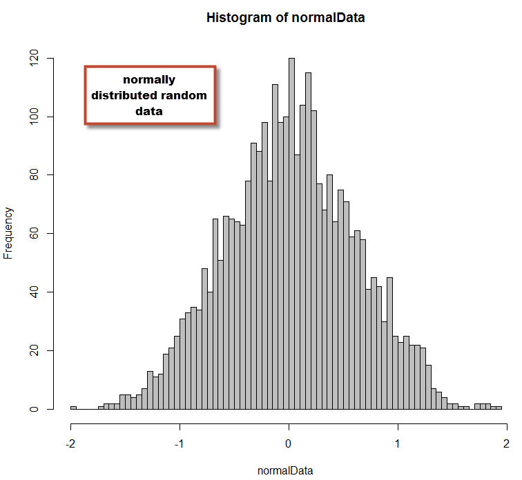
normalData <- rnorm(3000, mean = 0.009, sd = 0.6)
hist(normalData,,breaks=60,col='grey')
–
–
In the code above I have created normally distributed data with a mean of 0.009 and a standard deviation of 0.6. This matches the characteristics of EUR/USD daily data that I had studied in the first article of this series. With this distribution we can now perform some simple comparisons against our EUR/USD data so that we can see how similar or different the two distributions are. You can also perform statistical tests for normality (like a Shapiro-Wilk test) if you want to know within a certain confidence interval if your data belongs to a normal distribution. These tests are useful to assess whether your data is or isn’t normally distributed but they aren’t very useful when your data is not normally distributed (our case) and you want to have some sense of how different your distribution is from normally distributed data. However you can use these tests to see if transformations (such as the logarithm of returns mentioned on the first post) does lead to normally distributed data.
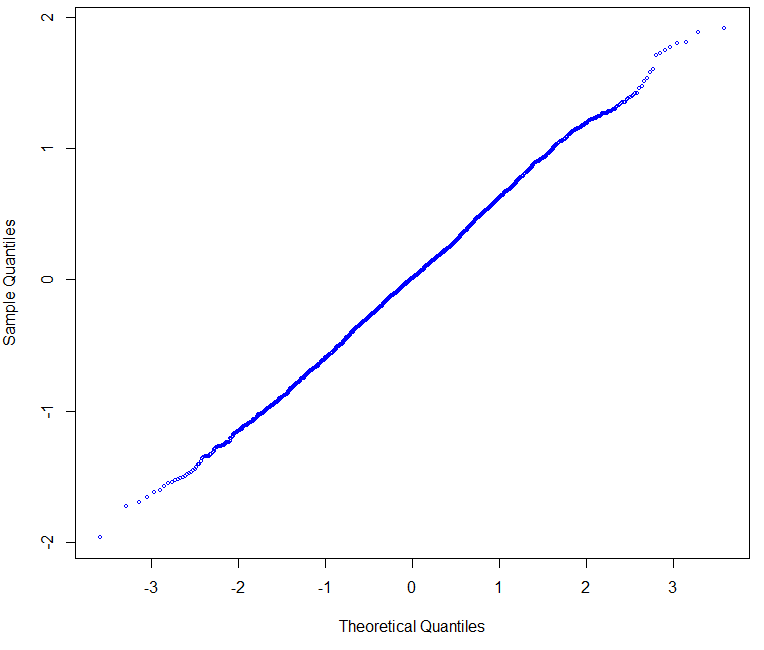
A very useful plot we can make is the Q-Q plot, which plots the Sample Quantiles Vs the Normal Theoretical Quantiles of a distribution. A normal distribution shows a perfectly straight line that may bend only very slightly at the extremes. The Q-Q plot of our distribution compared to the Q-Q plot of a normal distribution can show us how close or far away we are from a perfectly normal distribution. In order for the plots to have the highest comparative value it is also important to make sure that the normal distribution generated has the same average and standard deviation as the data you’re evaluating against. We can easily make these plots in R by using the qqnorm command:
–
qqnorm(normalData, col='blue', cex=0.5)
qqnorm(returns_EURUSD,col='blue', cex=0.5)
–
–
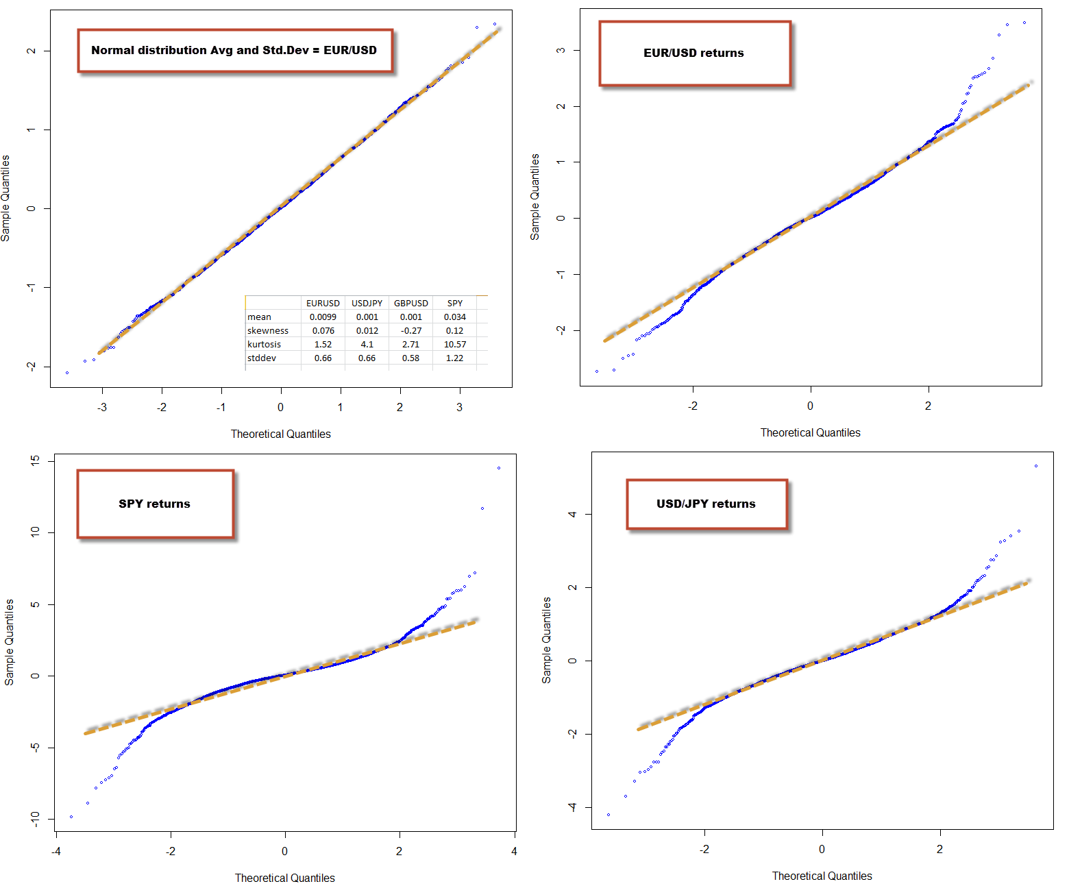
As you can see, the EUR/USD has results that are deviated from normality by the presence of some fat tails within the distribution. You can see that we have higher probabilities for the lateral extremes of the distribution while the central part of our data does conform to the expectation from a normal distribution. This conforms to the general understanding and evidence showing that financial time series aren’t normally distributed, primarily due to an exceedingly high kurtosis that puts them away from this ideal type of distribution. This happens mainly because on instruments with finite liquidity, news and intervention generate sudden changes in sentiment that cause abnormally large movements. If there was no news (no new information) or if liquidity was infinite, financial time series would be normally distributed and would follow a perfect random walk.
The interesting thing however is when you compare the qqnorm plots and statistical characteristics of one financial time series against others. One of the things that has amazed me since I started Forex trading is that finding +10 year historically profitable systems on the EUR/USD is very easy, while doing so for other instruments (even other Forex majors) is quite hard. Can a comparison between the EUR/USD returns and other FX and non-FX symbols hint as to why this might be the case? The image below shows you the qqnorm plot of the normal distribution, the EUR/USD, the USD/JPY and the SPY. Notice any difference? The SPY has the highest kurtosis, followed by the USD/JPY and then the EUR/USD. However it’s easy to notice that both the USD/JPY and the SPY deviate much more heavily from normality when compared to the EUR/USD that has only a slight degree of kurtosis.
However the SPY is a long term positive bias instrument, meaning that making money on this instrument is easy, provided you always go long. Is there any evidence of this within our time series analysis? The image above image also contains a table with the mean, skewness, kurtosis and standard deviation for the EUR/USD, USD/JPY, GBP/USD and the SPY. Notice how the skewness and mean for the SPY are both the highest and most positive. The skewness for the SPY is very high, meaning that it has a tendency for returns to be positive a.k.a a long term fundamental positive bias. This is also manifested on the mean, which is the largest and most positive for all the instruments (note that the mean has limited meaning on non-normally distributed data). Notice that the skewness for all FX instruments is reduced, as well as the mean.
–
–
From my experience, it seems that the more deviated from normality an instrument is (especially with low skewness), the harder it is to make money on it (at least through regular alpha seeking strategies). Deviations from normality imply that there are many events of higher-than-normal volatility that are basically unpredictable (I believe) from the underlying data. When there is a large positive skewness these deviations tend to be biased towards one side, allowing you to make money on a fundamental bias (like on the SPY) while for instruments with low skewness (like the USD/JPY) there is a high tendency for these events to be randomly aligned. In fact if you try to find a short edge on the SPY you’ll see that it’s very hard as well, because you have a high kurtosis to deal with that makes this just as hard as for a symbol like the USD/JPY. If you have any opinions on this matter feel free to share them on the comments :o)
On the next post of this series we will be exploring some other time series characteristics, this time using quantmod :o) If you would like to learn more about the statistical analysis of time series and trading systems and how you too can generate your own algorithmic trading strategies please consider joining Asirikuy.com, a website filled with educational videos, trading systems, development and a sound, honest and transparent approach towards automated trading in general . I hope you enjoyed this article ! :o)


[…] the easiest. Before following this tutorial I would also advice you to read my previous two (1 , 2)R tutorials on basic time series analysis, so that you are familiarized with some basic R […]