When people study economics or even simply study for FINRA exams they are told that markets become efficient as a function of market volume and market information distribution. The more the number of people trading an instrument and the better informed they are the more efficiently that financial asset will behave. However when we look at measures of market efficiency in Forex we typically find this not to be the case. On today’s post I want to talk about an academic study published earlier this year in which the Efficiency Index is used to calculate and rank the efficiency of more than 100 different currencies against gold (images below are taken from this study). This study aligns very well with several empirical observations I have made through the years and further emphasizes that currency pairs are not efficient and that more liquid instruments are generally far less efficient than less liquid ones.
–

–
In this article the authors examine the efficiency of 142 different currencies paired against gold using data from Oanda from 2011 to 2014. They evaluate efficiency using the “efficiency index” which is simply a measure of the efficiency of a given instrument calculated using several different statistical measurements. Although I will dedicate an entire post to the calculation of the index later on, for now it is enough to know that in this paper it’s calculated using the Hurst exponent, the fractal dimension and the approximate entropy. All measures related to how well the tested instrument matches the behavior of a financial time series that follows a simple random walk. With these three measurements we can therefore obtain a rather well-rounded measurement of overall efficiency for a given currency pair. The higher the value of the calculated index the more inefficient a pair actually is.
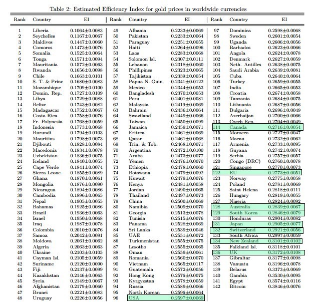
In contrast with what is expected we immediately find out that the most liquid markets tend to be among the most inefficient. I have highlighted the efficiency rankings for the most liquid gold markets in the chart below so that you can see how important this effect actually is. The NZD, AUD, JPY, GBP and EUR are all within the 20 most inefficient gold markets while the USD is among the top 50. If market efficiency was anywhere close to correlated with volume we would immediately find the USD and EUR gold markets to be the most efficient while markets like Liberia and Maldives would be the most inefficient. This striking and almost inverse correlation between efficiency and volume is actually telling us something important about how the market works, something that diverges radically from the efficient market hypothesis and from other results with other financial instruments.
–

–
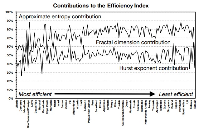
The contributions to the market efficiency index for each pair are also something interesting to study. As showed in the first image above the authors make an effort to understand how contributions change as a function of the different currency pairs and they do find differences between more efficient and less efficient markets. We find that the influence of approximate entropy decreases as markets become less efficient while the influence of the Hurst exponent and fractal dimension becomes more prominent.In any case the Hurst exponent is the most important contributor while the fractal dimension and approximate entropy play smaller roles. This may be related to the reason why the approximate entropy is a poor proxy for the number of systems that can be mined on a currency pair, it may well be that a more complete measurement of market efficiency is needed to properly predict this.
The authors explain this behavior by talking about the market period under study (2011-2014) and how QE has played a significant role in defining the currency and gold markets within this period. However the observations they have made closely match my experience with data-mining for systems on currency pairs on far longer time scales (from 1986 to present) showing to me that this phenomena is probably not something related exclusively to the QE used within this period and the “abnormal” conditions in terms of central bank monetary policy but something far more general and characteristic of the Forex market. buy Latuda online us The fact that it has always been far easier to mine EUR/USD and USD/JPY systems than for example AUD/CHF strategies may be related to how this chart plays out when measured against the USD within a much longer term analysis. Given that I have currency data from 1986 to present it becomes tempting to perform this same ranking exercise for the EUR, AUD, GBP, CHF, CAD and JPY against the USD. The present paper provides a rather simple and straightforward methodology to perform such measurements.
–

–
During some of my following posts I will go deeper into how the efficiency index can be calculated in R so that we can actually perform a similar but much longer term analysis for several different Forex pairs. I will also attempt to go deeper into why volume might be inversely related with the efficiency of a trading instrument and how we could actually predict which instrument might be better for the finding of algorithmic strategies. Of course if you would like to learn more about Forex trading, especially how to construct trading systems to trade the markets please consider joining Asirikuy.com, a website filled with educational videos, trading systems, development and a sound, honest and transparent approach towards automated trading.


