When analyzing trading symbols one of the aspects that might be more interesting is how well symbols can sustain constant momentum. To analyze this we might want to look at the distribution characteristics of consecutive bars with the same directionality to see whether there are any differences between the different symbols and what these differences might point to. Today we are going to see how we can use the R language in order to get this information and see whether there are any substantial differences among 16 different currency trading symbols. After that you can expand on the script showed below to analyse other timeframes and include other financial assets. You can download the data used within this article here. I also recommend you use RStudio to perform this analysis.
–
library(pracma)
library(quantmod)
library(ggplot2)
library(e1071)

calculate <- function(fxdata, symbol){

  ret <- fxdata
  consecutive <- ret>0
  consecutive <- sequence(rle(as.character(consecutive$Delt.1.arithmetic))$lengths)

  answer <- c()
  answer$kurtosis <- kurtosis(consecutive)
  answer$means <- mean(consecutive)
  answer$sd <- sd(consecutive)

  return(answer)
}

symbol.set = c("EURUSD","AUDUSD","GBPUSD","EURJPY","GBPJPY","USDJPY","USDCAD","EURCAD","USDCHF","EURAUD","AUDCHF","AUDCAD","GBPAUD","CHFJPY","CADJPY","EURCHF")

allSymbolValues <- data.frame(matrix(NA, nrow = length(symbol.set) , ncol = 2))
colnames(allSymbolValues) <- c("symbol","kurtosis", "mean", "sd")

for (x in 1 : length(symbol.set)) {
  path <- paste("/path_to_data/", symbol.set[x], "1987_MONTHLY.csv", sep="")
  fxdatatemp <- read.zoo(path, sep = ",",format="%d/%m/%y %H:%M", header=FALSE,index.column=1)
  fxdata<- as.xts(fxdatatemp)
  colnames(fxdata) <- c("open", "high", "low", "close", "vol")
  fxdata <-Delt(fxdata$close, type="arithmetic")
  fxdata <- fxdata[2:length(fxdata)]
  cat("loading", symbol.set[x] , '\n')
  data <- calculate(fxdata, symbol.set[x])
  allSymbolValues$kurtosis[x] = data$kurtosis
  allSymbolValues$mean[x] = data$mean
  allSymbolValues$sd[x] = data$sd
}

allSymbolValues$symbol = symbol.set

allSymbolValues <- allSymbolValues[order(allSymbolValues$kurtosis),]
allSymbolValues$symbol <- factor(allSymbolValues$symbol, levels = allSymbolValues$symbol, ordered = TRUE)

ggplot(data=allSymbolValues, aes(x=symbol,y=kurtosis)) +
  geom_bar(fill="blue", width=.8, stat="identity") +
  guides(fill=FALSE) +
  xlab("Pair") + ylab("Kurtosis") +
  theme(axis.text.x = element_text(angle = 90, hjust = 1))

allSymbolValues <- allSymbolValues[order(allSymbolValues$mean),]
allSymbolValues$symbol <- factor(allSymbolValues$symbol, levels = allSymbolValues$symbol, ordered = TRUE)

ggplot(data=allSymbolValues, aes(x=symbol,y=mean)) +
  geom_bar(fill="blue", width=.8, stat="identity") +
  guides(fill=FALSE) +
  xlab("Pair") + ylab("Mean") +
  theme(axis.text.x = element_text(angle = 90, hjust = 1))

allSymbolValues <- allSymbolValues[order(allSymbolValues$sd),]
allSymbolValues$symbol <- factor(allSymbolValues$symbol, levels = allSymbolValues$symbol, ordered = TRUE)

ggplot(data=allSymbolValues, aes(x=symbol,y=sd)) +
  geom_bar(fill="blue", width=.8, stat="identity") +
  guides(fill=FALSE) +
  xlab("Pair") + ylab("StdDev") +
  theme(axis.text.x = element_text(angle = 90, hjust = 1))
–
Momentum in financial instruments is not very easy to define. Intuitively we think of momentum as a tendency for an asset to continue going in a given direction but for how long and in what measure are two variables that make the measuring of momentum quite difficult. If we’re interested in a simple way to measure long term trends we might want to look at the consecutive number of bars with the same directionality across a longer term timeframe. For example an instrument that has a higher average of consecutive monthly bars with the same directionality can certainly be said to have higher momentum, at least concerning long term trading, than an instrument that has a smaller average. Due to this reason we will be performing the analysis of these 16 currency pairs using 30 years of monthly data (352 bars) with the data you can download at the beginning of this article.
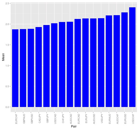
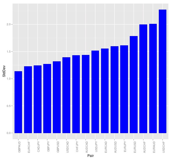
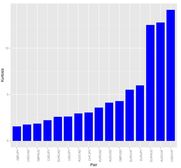
The R script above calculates an array where the number of consecutive bars with the same directionality is represented by an integer. For example if the monthly returns have been 1%, 2%, 1%, -3% and -1% the values of this array would be 1, 2, 3, 1, 2. Analyzing this array can therefore provide us with important information about the momentum within the series. The script plots the kurtosis, mean and standard deviation for this array for the 16 different symbols, where it becomes clear that some symbols have much stronger momentum than others.
–

–
The average values for the different symbols, in the image above, shows that the highest momentum belongs to the EUR/USD, USD/CHF, AUD/CHF and EUR/AUD as these symbols have the highest averages. As you can see the average is well above 2 for these instruments meaning that we could start thinking about monthly strategies that exploit momentum just by following the direction of the last monthly bar in these pairs. Of course this measurement only accounts for directionality – not the actual length of the bars – meaning that much further analysis would be required before profitable systems could be derived from this information. However the above already shows that if you wanted to develop a long term trend following strategy it would probably not be a very good idea to use GBP pairs, which have the lowest tendency to show consecutive bars with the same directionality.
The kurtosis and standard deviation charts – showed below – also provide some interesting information. For example not only is the USDCHF the symbol with the highest average but it is also the symbol with the highest standard deviation. This is not surprising when we look at the kurtosis measurements, which show that the USD/CHF has the fattest tails in the distribution of consecutive bars. This means that the USD/CHF had some times when there were very high number of consecutive bars in the monthly timeframe – even almost years where all months have the same directionality – when at other times directionality fluctuated much more heavily. This means that potential drawdowns between profitable periods in systems that attempted to follow momentum could be high. On the other hand the EUR/USD had a rather high mean momentum but yet a much lower kurtosis and much lower standard deviation than the USD/CHF, making it a much more ideal candidate when compared with the other high momentum symbols.
–


–
What I wanted to show you in this post is mainly how you can perform some simple analysis of currency symbols that will start to show you some interesting differences between their characteristics. This information can guide you in the development of trading systems so that you try to exploit the characteristics that seem most plausible within each different trading instrument. The above script and analysis can definitely be expanded to include other symbols or to draw other information. For example if you added information about bar volatility you could change graphs to include the actual average consecutive cumulative movement, instead of just the number of bars with the same directionality, which would allow you to derive much more useful information. If you would like to learn more about analysing symbols and creating trading strategies please consider joining Asirikuy.com, a website filled with educational videos, trading systems, development and a sound, honest and transparent approach towards automated trading.


