Last week a very interesting article by the Swiss Central Bank was brought to my attention by a dear friend and Asirikuy member. The article, which you can download here, talks about the distribution of returns at specific hours through the Forex market and makes the point that currencies tend to depreciate within their market trading times and appreciate outside of their sessions. On today’s post I am going to show you the results of this same analysis carried out using our 1986-2016 currency data and whether it does or does not support the results put forward by the SNB. Furthermore we are going to be talking about the differences that appear and why market structure might have changed significantly since the time when this article was first published. Asirikuy members can use the R code below to reproduce the results using the 1H data files available within the back-testing data section of the website.
–
# Dr.Daniel Fernandez 2016
# http://mechanicalforex.com
# https://asirikuy.com

library(quantmod)
library(ggplot2)

fxdatatemp <- read.zoo("pathToHourlyData.csv", sep = ",",format="%d/%m/%y %H:%M", header=FALSE,index.column=1, FUN=as.POSIXct)
fxdata<- as.xts(fxdatatemp)
colnames(fxdata) <- c("open", "high", "low", "close", "vol")

fxdata$hour <- as.POSIXlt(index(fxdata))$hour
fxdata$ret <- c(0, ROC(fxdata$close, type="discrete", na.pad=FALSE))

results <- data.frame(ret=0,
                      hours=seq(0,23),
                      stringsAsFactors=FALSE)

for(i in 1:24){
  results$ret[i-1] = 100*mean(fxdata[fxdata$hour==(i-1),]$ret)
}

ggplot(data=results, aes(x=hours, y=ret)) +
  geom_bar(stat="identity") +
  xlab("Hour GMT +1/+2") + ylab("Mean Return (%)") +
  annotate("rect",xmin = 13-0.5, xmax = 20+0.5,   ymin = min(results$ret), ymax = max(results$ret), alpha=0.2,  fill = "red") +
annotate("rect",xmin = 8-0.5, xmax = 16+0.5,   ymin = min(results$ret), ymax = max(results$ret), alpha=0.2,  fill = "green") +
annotate("rect",xmin = 22-0.5, xmax = 23+0.5,   ymin = min(results$ret), ymax = max(results$ret), alpha=0.2,  fill = "yellow") +
annotate("rect",xmin = 0-0.5, xmax = 7+0.5,   ymin = min(results$ret), ymax = max(results$ret), alpha=0.2,  fill = "yellow")
–
It would certainly be very interesting if market trading times and particularly sessions would be correlated to some return directionality as it would make it easy to trade the Forex market since there would be a rather fundamental inefficiency related to the very nature of the market itself. If the EUR tended to depreciate when the market was open in Europe grasping a profit would be as easy as simply selling EUR in the beginning of the session and buying at the point of statistically predicted peak return. Although the volatility of such a strategy would be expected to be high – therefore leverage would need to be limited – it would be successful if there was a long term statistical effect.
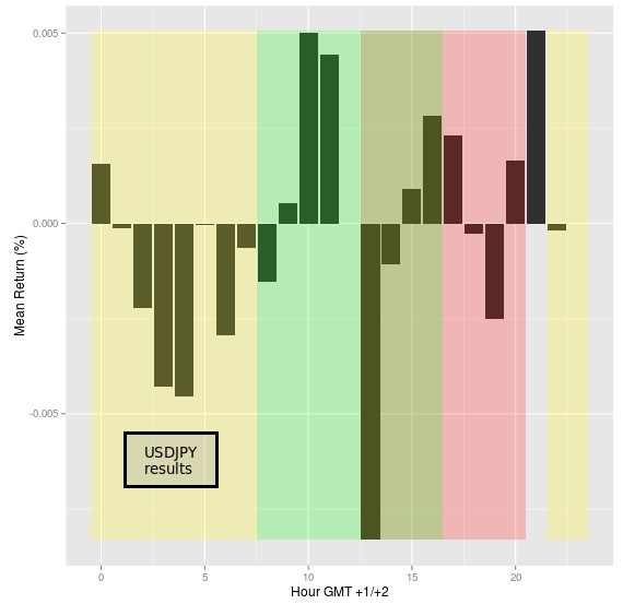
Although the SNB article shows average cumulative daily returns I thought it to be more informative to look at average returns per hour for each pair to see if there is really a tendency for returns to be aligned towards any given direction during the day and in particular during the market trading sessions. In the plots shown below the market sessions are also graphed as yellow (Tokyo), green (London) and red (New York). The time is GMT +1/+2 where the DST matches the DST of the London timeframe. This also closely matches the DST of the New York timeframe although 1 or 2 week differences may appear through the year (although these differences do not significantly affect the results showed).
–

–
The EUR/USD results showed above match the results of the article with returns showing to be somewhat positive during the Asian session, then turning negative during the European session and finally remaining positive through the bulk of the US session. Despite the introduction of more than 10 years of additional data from the results of that article the conclusion still holds reason why the above could be considered interesting as a basis for the construction of a trading strategy that went short EUR/USD during the European session and then long EUR/USD during the US session.
In the case of the USD/JPY results also remain similar, there is a substantial depreciation of the Yen observed during the beginning of the Asian sessions (actually the Sydney open) but after that there is a continued appreciation of the Yen within the subsequent hours, also in agreement with the SNB data. The USD then depreciates heavily against the Yen during the beginning of the trading session, then oscillating through the rest of the American session up to the market close. In the case of the Yen rather than using a session lasting strategy it might be better to simply attempt to catch the market opening times in order to benefit from the largest expected returns in favor and against the currency.
–

–
In the SNB article they could indeed create profitable strategies using sessions only for the EUR/USD while for other pairs this was not possible since their sessions were not so favorably distributed to allow them to overcome trading costs. If you have access to our trading data – or your own data from other sources – you can repeat the above analysis and even perform it for other pairs to see how they compare with the SNB conclusions. Whether a profitable trading system can be created from this data is also a question that I will seek to answer within a future trading post. If you would like to learn more about statistical analysis and how you too can use our tools and data to create your own trading systems please consider joining Asirikuy.com, a website filled with educational videos, trading systems, development and a sound, honest and transparent approach towards automated trading.strategies


