What is support and resistance? Is this real? Is this an illusion? These questions have been on my mind during the past 6 years and I have dedicated a significant amount of time to find out how to accurately quantify and define support and resistance and see if there is actually any real substance to this concept. In the past I have attempted to create methods that measure these levels in a similar way as traders seem to perceive them and I have written several articles related to the way in which we can design trading systems based on these measurements. However up until now I hadn’t developed any measurements that could say if there was something really “special” about a given price level or if what we see as support and resistance are merely illusions caused by randomness. On today’s post I will share with you a real and solid statistical method I have developed to find and quantify support and resistance levels that can say the exact confidence with which you know that a level is actually important.
–
–
There is no clear cut definition for support and resistance. The definitions are as diverse as discretionary traders out there and it may well be that my definition of S&R might not fit what you exactly conceive them to be. It is therefore important to provide a definition of S&R for the purpose of this article and the portrayed method. I will define a resistance or support level as a price zone where price tends to go an abnormal amount of time within the recent past and then reverse. For resistance levels this means that price reached this zone on a high and then moved down while a support level is a zone reached on a low where price retraced to a higher value after. I am using zones as price can bounce from a region in the X +/- 5 pip region instead of a precise exact price level, although this can be adjusted to whatever zone width the trader wishes to use.
The key to distinguish what an S&R level is lies precisely within the word “abnormal”. It is not simply that price tends to bounce from a level, we need this bouncing to go above the level of bouncing that would be expected simply from random chance. You can see price bouncing of different levels if you generate a random financial time series using Brownian moniton, but this does not mean that these levels have any statistical importance or any influence on future price action. The fact that price bounced off a given level does not give it any particular importance, it could just be that price happened to get there due to simple random chance. But how do we quantify and distinguish normal from abnormal bouncing?
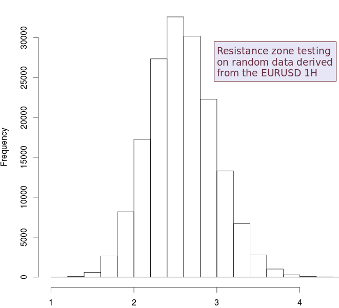
To do this I created a simple statistical methodology using random financial time series created using bootstrapping with replacement from an original time series. This preserves the distribution of ranges and returns of the original series but removes any past to future causal relationships (it makes the random series perfectly efficient). We can then look at the high/low of each candle and measure during the past 24 hours how many high/low values are within 5 pips of this value (zones as previously explained), we do this for each candle over each random financial time series. After doing this for 200+ random time series (until we see convergence) we get a distribution of expected average accumulations for a price level within the past 24 hours (first image above shows you the values for resistance zones for random data generated from the EURUSD 1H timeframe).
–
–
This frequency distribution immediately shows you that in random data derived from the EURUSD 1H the number of times a price zone is visited within the past 24 hours is distributed normally (as evidenced by an Anderson test), with a mean of 2.59 and a standard deviation of 0.40. This tells us that any zones where you see 2-3 visits within the past 24 hours are not statistically relevant, but are simply visits that we cannot say are not coming from randomness. Since we are dealing with a normal distribution we can immediately establish confidence intervals for judging S&R levels, for example we can see that a mean+4*standardDeviation value should give us a confidence that there is an abnormal accumulation within a price level of around 99%. This means that if you measured the number of highs that visited the resistance zone within the past 24 hours on the EURUSD 1H and it yielded a result of 4-5 you could say with a 99% confidence that this level has an abnormal accumulation of visits compared with behavior expected from randomness. This means that we can actually say with a large confidence that this behavior does not come from randomness.
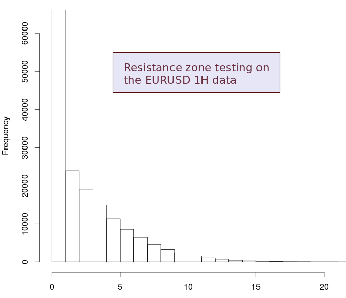
It is rather interesting to then look at the same distribution showed above but for the actual EURUSD 1H data (second image) and see how many times we actually fall out of the normal accumulation expected from random data. The distribution is actually very different when compared with the first one and shows us that there are a very significant amount of cases where the accumulation of price around zones is very large >=5 (actually 17.9% of the time). It is no wonder then that there are so many traders that swear on the effectiveness and use of support and resistance levels, we can actually see that there are price levels in the real data where we have a level of accumulation that is far larger than the level we would expect if price simply behaved randomly. Chad Support and resistance is a real, statistically observable and quantifiable phenomena.
The above does not tell you how to use this information to create a trading strategy (something we will explore later on) but it does show that there is an objective way to quantify and draw S&R levels that goes beyond simply searching for accumulation within a price series, there is actually a way to say if levels are relevant against what is expected from simple random behavior. If you would like to learn more about trading system design and how we create strategies please consider joining Asirikuy.com, a website filled with educational videos, trading systems, development and a sound, honest and transparent approach towards automated trading.


Interesting article and well written. However, something seems to be off… I have never seen that large of a shift in distributions without some sort of methodological error. This is interesting and I’d like to take a deeper look. A few questions:
1. What, exactly, is the horizontal axis? How is it generated? Is it the same in both graphs?
2. I don’t understand exactly how the levels were generated, but this is probably a reflection of my confusion over #1. You may have explained it clearly enough in the article, but I didn’t get it.
3. Your second chart is suggestive of some kind of arcsine law-related effect. Does the second graph relate the “levels” to the open of each session and somehow relate the levels touched to that open price? If so, does the first graph not do that? In other words, the first graph shows a much longer run of data. If so, you’re likely picking up simple random walk properties that are often surprising to people. (It’s why people think the open is “special”.) A paper that is relevant is Acar, Emmanuel, and Robert Toffel. “Highs and Lows: Times of the Day in the Currency CME Market.
I’d like to dig a bit deeper into this as it mirrors some work I’m doing. Feel free to answer email if you don’t want this comment on your site.
Thank you and thank you for your work!
Thanks a lot for commenting :o) Let me answer your questions:
1. The horizontal axis is the number of bar highs from the last 24 highs that were within 5 pips of the current candle’s high. The first graph is built from using random data sets constructed using bootstrapping with replacement, you could say from this graph that there are 30,000 cases where there are on average 2.5 bars within 5 pips of the current high looking 24 hours into the past.
2. I believe #1 should answer this question, I look at each high, then look at how many from the past 24 highs are within 5 pips of the current high.
3. No, there is no relationship with the open. I am quantifying in the exact same effect as I did on the random data sets. Do let me know if you believe there might be some problem with what I did.
Thanks again for writing :o)
Best Regards,
Daniel
ok thanks yes that answers the questions. Let me play with this a bit… don’t expect a quick turnaround but feel free to drop me email if you don’t hear from me in a week or two.
Thank you. Nice blog, btw.