When we create a trading strategy one of the most important things we have to do is analyse the historical results in order to assess the historical weaknesses and strengths of our trading system. Regular software like MT4 or MT5 – which are closed source – have limited statistics presented in often fixed ways that heavily limit the ability of a trader to obtain the statistics he or she desires. Using the R statistical software we can create robust performance statistics for our trading strategies without the limitations of close sourced software with the ability to build custom reports and have full control over the appearance of the graphics being presented. In today’s post we’re going to learn how to use R to build performance statistics for our trading systems in a manner that is easy-to-do, expandable and that easily leads to the construction of custom reports. For this post we are going to be using the quantmod, PerformanceAnalytics, xtable, xts and ggplot2 packages so make sure you have them all installed before you continue reading. As always, I heavily encourage the use of R studio to perform these experiments.
The first important thing is the format of your system’s result data. For this experiment we need the system results file to have 2 columns, one containing trade closing times and the second one containing balance values. The date can be in any format but you must be certain that your format matches the one yous specify on the read.zoo function. For this tutorial I will be using files with a “%d/%m/%Y %H:%M” date format (something like 25/12/1995 5:00). In order to generate performance statistics we are going to load our data into an xts object and we are then going to create monthly and yearly returns (using quantmod) that we can then analyse using functions from the performanceAnalytics function. We will also construct good looking plots of these results using the ggplot2 library. The code below loads your system result file into an xts object called “results” and then generates yearly and and monthly returns using quantmod. The “head” function displays the top values for the “results”, “monthly returns” and “yearly returns” objects so that you can confirm that everything was loaded properly.
–
library(quantmod)
library(PerformanceAnalytics)
library(xtable)
library(xts)
library(ggplot2)

resultsTEMP <- read.zoo("C:/pathToFile/results.csv",
sep = ",",format="%d/%m/%Y %H:%M", header=TRUE,index.column=1,
colClasses=c("character",rep("numeric",1)))

results<- as.xts(resultsTEMP)
head(results)
monthlyResults <-monthlyReturn(results)
head(monthlyResults)
yearlyResults <-yearlyReturn(results)
head(yearlyResults)
–
–
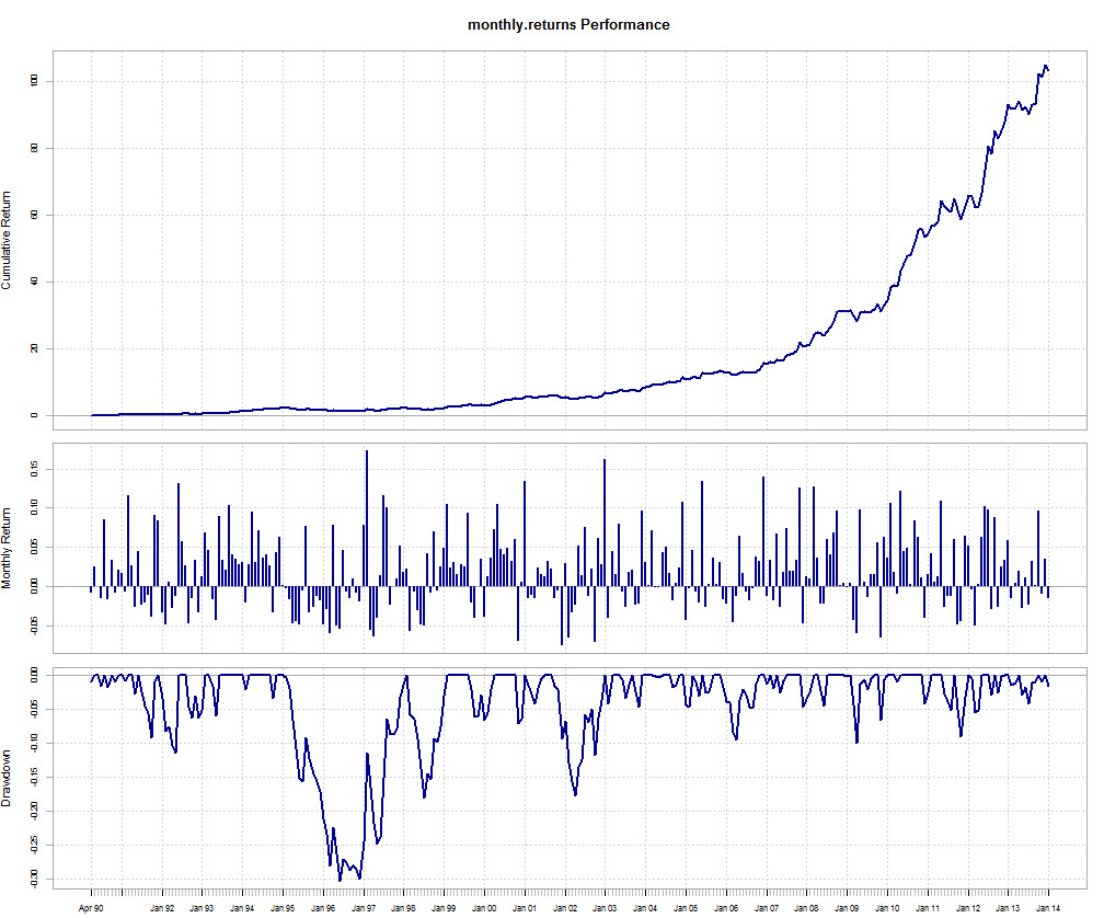
Now that we have loaded our data we can now generate some statistics to analyse our system results. The first thing you will want to do is draw an overall chart of your trading system usings the chars.PerformanceSummary command. This function creates a beautiful graph showing your system’s equity curve, the monthly returns and the drawdown periods. Please note that these values are all given as fractional returns, meaning that you need to multiply them by 100 to get a percentage. For example the graph I generated below has a maximum drawdown of -0.30, which is 30% in percentage terms. The performance summary graph already gives you important information about your trading strategy.
–
charts.PerformanceSummary(monthlyResults, colorset="darkblue")
–
–
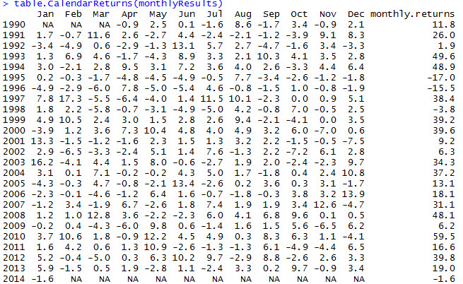
After getting this chart we can then obtain some tables to analyse using the table.CalendarReturns function applied to our monthly returns. This table can be used within a report to see both the monthly and yearly performance values through our whole test. Values here are given in actual percentage returns so there is no need to carry out any additional multiplications to analyse the results. Through this table you can easily see your best year, your worst year as well as the overall variations for each calendar month during every year. It is easy to see for example – on the system results given as an example – that September has been a profitable month since 2008 while it would be difficult to get this information from most other plots.
–
table.CalendarReturns(monthlyResults)
–
–
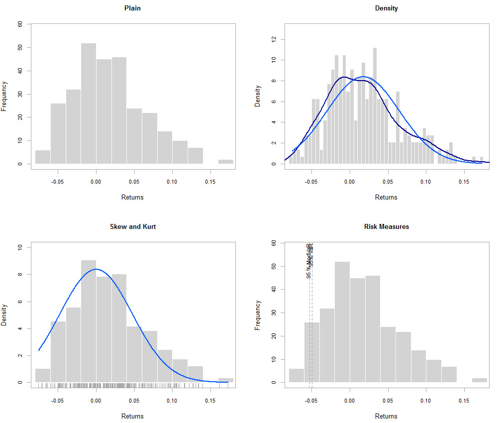
Another important set of statistics you want to have are related with your distribution of returns. We want to see the kurtosis and skewness of our distribution of returns as well as Risk measures. I took this idea form this tutorial related with the analysis of stock returns, so feel free to check it out for more information about this analysis and how you can also plot several of these analysis together if you have data for different systems loaded within a given xts object (more on this on a future post when we do system comparisons using R).
–
layout(rbind(c(1,2),c(3,4)))
chart.Histogram(monthlyResults[,1,drop=F], main = "Plain", methods = NULL)
chart.Histogram(monthlyResults[,1,drop=F], main = "Density",
breaks=40,methods = c("add.density", "add.normal"))
chart.Histogram(monthlyResults[,1,drop=F], main = "Skew and Kurt",
methods = c("add.centered", "add.rug"))
chart.Histogram(monthlyResults[,1,drop=F], main = "Risk Measures",
methods = c("add.risk"))
–
–
There are several additional statistics you can obtain from the PerformanceAnalytics library, so make sure you go through the documentation if you want to have a more powerful usage of this tool. You can easily obtain statistics such as your annualized return, maximum drawdown, downside risk, drawdowns and rollingPerforamnce using the options available within this R library. With this information you can build a good looking report that you can then put into a pdf using Latex (more on this on a later post). Finally we are going to create a yearly return graph as an example using the ggplot2 library which generated a good looking plot that you can also use to further analyse your trading results. The ggplot2 library offers a wide variety of plotting options, allowing for easy customization of your performance results.
–
layout(rbind(c(1,1),c(1,1)))
ggplot(yearlyResults, aes(x=index(yearlyResults), y=yearly.returns))
+ geom_bar(width=120, stat="identity")
+ opts(axis.text.x=theme_text(angle=-45))
–
–
As you can see we can use R for very varied things, including the analysis of our trading systems. Using the xtable, quantmod, PerformanceAnalytics and ggplot2 libraries we can create very easy-to-read analytics that can really help us better understand and analyse our trading strategies. If you would like to learn more about trading system analysis and how you too can perform advanced analysis beyond what MT4/MT5 or other programs will give you please consider joining Asirikuy.com, a website filled with educational videos, trading systems, development and a sound, honest and transparent approach towards automated trading in general . I hope you enjoyed this article ! :o)


I am new to R and trying to implement your code. Why is line 7
resultsTEMP <- read.zoo(“C:/pathToFile/results.csv”,
instead of
resultsTEMP <- read.zoo("C:/pathToFile/results.csv",
?
I guess the < symbol is showing as < ; on your website
This should be fixed now. Thanks for bringing it up!