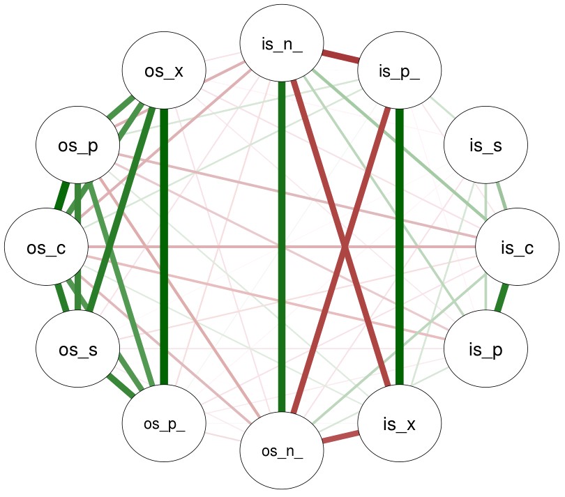
A few times in the past I have talked about in-sample/out-of-sample (IS/OS) relationships in our price action based repository and how the relationships up until now have been relatively weak, making it very difficult to make sound prediction of OS success based solely on IS statistical measurements. Today I want to show you some alternative visualizations of these relationships using the qgraph R package which offers some outstanding functions for the creation of easy-to-understand plots that explain the relationships between different variables in high complexity data sets. In this case all the IS and OS variables are marked accordingly. The variables are then followed by a later that describes the exact variable (x = expectancy, n_ = number of trades, p = profit, p_ = profit factor, c = CAGR, s = Sharpe). Note that the OS here is a real OS (time after the systems started live trading).
–
–
All systems in the repository have in-sample frequency values above 10 trades per year, R² values above 0.95 and Sharpe ratio values above 0.7. All of these systems have also passed a DMB evaluation process with a lower than 1% chance to come from the strength of the mining process alone. The image above shows you the IS/OS relationships in the repository for our non-TP containing system, that is, systems that only use functionally adjusted SL values and therefore can only exit trades either through a trailing SL or through the closing of trading positions. Stronger positive correlations are showed in green while stronger negative correlations are showed in red.
In the IS we have a strong negative relationship between expectancy, PF and frequency, which implies that systems in this part of our repository tend to have worse average per-trade outcomes in the IS as the number of trades increases. We also have a strong relationship between PF (p_) and expectancy (x) which is not surprising given that both of these statistics are strongly related mathematically. Interestingly the Sharpe is completely unrelated with any other IS variables, with no strong relationships to either CAGR, PF or expectancy. This is not surprising as the Sharpe measures equity curve quality and can be basically unrelated with these other variables.
–
–
In the OS we have much stronger correlations between all the OS variables. This might be because the OS periods are in general of a much more limited length as most systems in the repository have been trading for a little bit more than a year. However in this case we do see far stronger CAGR/Sharpe/PF correlations which are unseen in the IS. In this case trade number is also very weekly related with the expectancy or the profit factor, showing again an important difference with the relationship of the IS statistics.
It is also apparent that there are practically only weak IS/OS relationships except for the case of the number of trades (n_) where there is a strong correlation between the IS and the OS. There are some weak negative correlations – suggesting that the systems have been mainly mean-reverting during the OS – but these relationships are very weak and sadly aren’t that useful for the prediction of OS success.
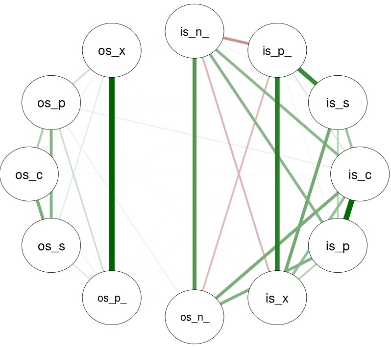
The second image in the post shows the same relationship plot for the TP containing part of our trading system repository. As you can see changing the system type drastically changes the relationships we see. Especially relationships in the OS become weaker and the previously weak negative correlations suggesting mean-reverting behavior have now completely disappeared, leaving us with only faintly positive correlations between the OS profit and the IS CAGR. The TP side of the repository is also significantly younger – with most systems having less than 6 months of OOS – so it will be interesting to see whether these relationships in both sections of our repository become convergent as a function of time.
–

–
As you can see relationships between the IS/OS are still weak, making it hard to draw OS success predictions from IS variables. With time however it seems that these relationships tend to become stronger – as we can see in the non-TP side of the repository – so hopefully clearer relationships will appear with time, allowing us to make better predictions of long term success. If you would like to learn more about our repository and how you too can trade using these strategies please consider joining Asirikuy.com, a website filled with educational videos, trading systems, development and a sound, honest and transparent approach towards automated trading.strategies.


Hi Daniel,
Is your analysis done on winning systems only or on all of them?
I think it might be interesting to have good strategies (and its correlations) compared with the bad ones.
Just a thought.
mac
Hi Mac,
Thanks for writing. This is for all the strategies, including winning and losing ones. Good idea! I’ll look into whether correlations do change depending on OS system performance,
Best Regards,
Daniel